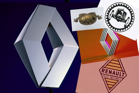
► 117 years of Renault’s logos
► From Art Nouveau to Op Art
► Subtle refresh for 2015
Renault is unveiling a new ‘brand universe’ across its dealers and offices globally in 2015. That’s slightly pretentious marketing speak for a subtle, undramatic refresh of its corporate emblem and slogan. Perfect timing, though, for a quick trawl through the archives to look back on 117 years of La Regie’s logos.
1900: Sans diamants
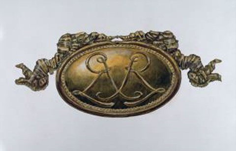
Top marks for recognising Renault’s first logo without a degree-level knowledge of all automotive badges from the 20th century. Renault’s (then called ‘Renault-Frères’) first badge incorporated the initials of the three founding brothers of the company, entwined in an Art Nouveau-styled medallion – and without a diamond in sight. It was a simpler time; it was a better time.
1906: First time for everything
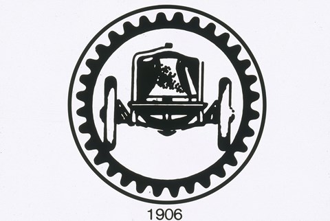
In 1906, the elegance was ditched for company pride as the medallion was replaced with an image of the first French grand prix winner: a Renault. Today, this looks more like something likely to be used by the David Brown owners’ club than an established car manufacturer, though after the First World War the image was changed again. In 1918 the car was replaced with the Renault-produced FT17 tank.
1923: Grille seekers
With just the solitary brother Louis left at the helm, the company decided to place the logo on the car for the first time. Renault adopted a round, metallic grille and secured it to the ‘Alligator’ bonnet which not only made the logo more recognisable, but also functional as it served as a cover for the car’s all-important horn. Neat.
1946: National authority
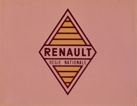
During the mid ’20s, the logo gained more angular contours, and throughout the rest of the decade, and the next, the company became most associated with the diamond-shaped design. 1945 marked a change in status for Renault as they became nationalised and the self-proclaimed ‘Automobile of France’. Leading the way for this new-found national pride was the famous diamond shape, and in 1946 the logo was printed in colour for the first time. From then on, yellow would forever be Renault.
1972: Vasarely’s vision
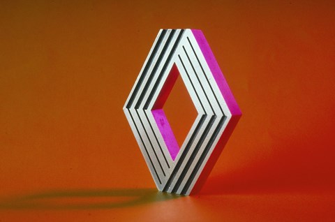
As time passed, the diamond became indissociable from the company and was included in all documents and adverts. In the early ’70s, however, it was decided that it wouldn’t do any harm to make the logo just a little bit bolder. They ditched the name and employed op art legend Victor Vasarely, working with his son, to re invent the logo. He came up with a new treatment for the diamond shape, housed in a hexagonal perimeter that is still used today (though in 1972 it was based on parallel lines). With Victor’s father-son relationship now stronger than ever, so was Renault’s brand identity.
1992: Pointed (in the right direction)
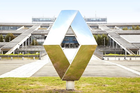
Twenty years after the creation of the Vasarely logo, Renault decided it was time for a change. The redesigned logo kept the Vasarely shape but replaced the parallel lines with a new 3D relief. Since then, small tweaks have been made to the logo: the diamond’s now bolder and the yellow is brighter, but the same ’92 design is still used to this day, becoming one of the most recognisable logos in the industry.
2015: Plus ça change…
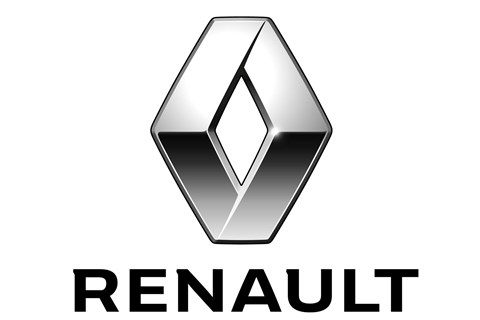
And here’s the new, 2015 Renault logo treatment. Spot the difference? Nope, us neither…